Renesse

Renesse
- Year
2016
- Sector
- FMCG
- Services
- Branding
- Packaging
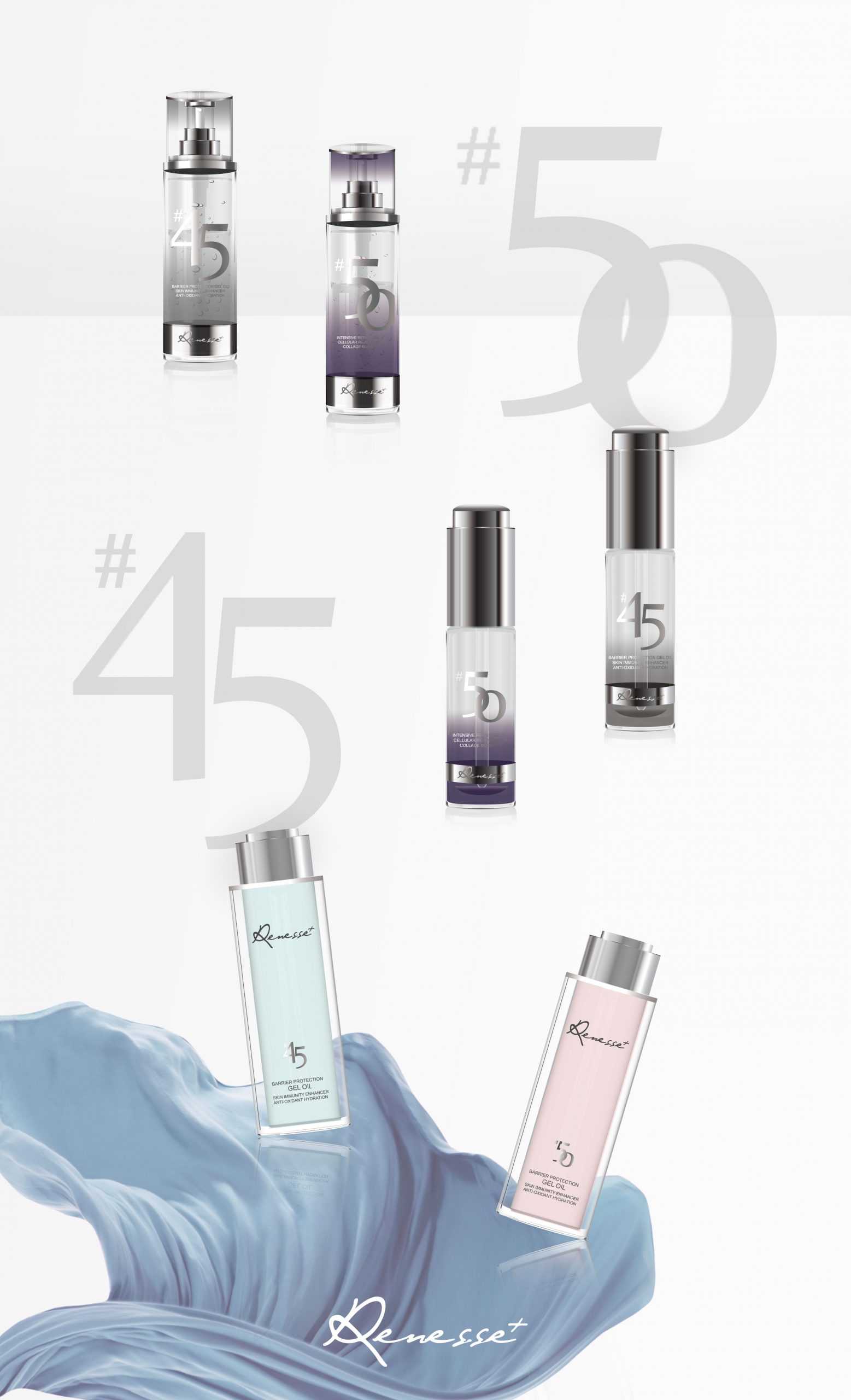
Renesse is a highly effective Australian skincare brand, which came to the market in 2015. The brand is committed to car caring e for women’s health, to emphasise a scientific skincare idea and to embrace women’s independent spirit. Nexty was approached to provide a series of services including brand naming, brand design and packaging design. The main goal that we wanted to achieve through this project was to build a unique brand identity to convey the product features while attracting the customers to purchase. Life becomes increasing in diversity with the development of the economy. Therefore, we conducted an in-depth analysis towards the skincare product packaging methods, style and trends. In addition, the research of consumers’ purchasing behaviour and motivation significantly improved the design process.
The handwritten typeface in the brand symbolising their skincare products is their signature of the brand, demonstrating Renesse’s delicate care towards women. The lightsome typeface conveys a fresh yet fashionable brand image. The “+” sign reflects the business’s concentration of the functionality and effect that it brings to clients – that creates a brand association of transformation and promotion. The natural essence can be visualised through a frosted & clear mixed textured glass container, the use of the material and techniques such as tinted gradient colour, engraving, foiling and so on, that brings a superior quality presence. The ultimate aim is to distinguish the product from the competitors and bring a consistent brand unity throughout the full range of product lines, with a sense of elegant, high-end and classic.


